Shareable Image
Pure blue color background with HEX code, RGB values and color meaning
Pure blue color background with HEX code, RGB values and color meaning
Pure blue color background with HEX code, RGB values and color meaning explores one of the most important colors in the visible spectrum and modern digital technology. Represented by the hexadecimal code #0000FF, pure blue is a highly saturated color belonging to the cool color family. It is one of the three primary colors in the additive RGB color model, alongside red and green. Blue is widely associated with trust, calmness, confidence, clarity, intelligence, and stability, making it popular in technology, branding, graphic design, photography, fashion, and visual communication.
This educational infographic presents a vibrant pure blue background with a large white BLUE heading, a classification label identifying blue as a spectral color belonging to the cool color family, and a carefully organized dark navy information panel. The panel includes a circular blue color swatch, HEX and RGB values, HSL and HSV specifications, color family information, and an explanation of blue's importance in the RGB light model. The design combines visual simplicity with scientific and technical information, making it useful for students, teachers, developers, designers, and anyone interested in understanding colors.
What is blue?
Blue is a chromatic color associated with a region of the visible light spectrum between violet and green. In traditional rainbow education, blue appears between indigo and green in the VIBGYOR sequence. It is generally classified as a cool color and is frequently associated with the sky, oceans, water, and natural landscapes.
Blue light is commonly associated with wavelengths of approximately 450 to 495 nanometers, although the exact boundaries vary between scientific references and classification systems. Natural blue light exists as part of the continuous visible spectrum, while digital blue is created through the controlled emission of light from display components.
The specific blue featured in this infographic is #0000FF, commonly called pure blue or RGB blue. It represents the maximum blue channel value with zero red and green contributions in the standard RGB color model.
Pure blue technical color specifications
Color name: Blue
Reference shade: Pure blue / RGB blue
HEX code: #0000FF
RGB: (0, 0, 255)
HSL: (240°, 100%, 50%)
HSV / HSB: (240°, 100%, 100%)
CMYK: Approximately (100%, 100%, 0%, 0%) using a simplified mathematical conversion
Color family: Blue
Color classification: Chromatic / spectral color family
Color temperature: Cool
RGB color model: Primary color
Traditional RYB color model: Primary color
Traditional VIBGYOR position: Third
Approximate spectral wavelength region: 450–495 nm
HSL saturation: 100%
HSV value: 100%
Relative luminance: Approximately 0.0722 in sRGB
Reference color space: sRGB
CSS color keyword: blue
These values describe the specific digital color #0000FF rather than every shade of blue. The approximate CMYK values are not guaranteed printing specifications. Actual printing results depend on the printer, ink, paper, color profile, and color-management process.
Understanding the blue HEX code #0000FF
Hexadecimal color notation is widely used in web development, graphic design, image editing, and digital applications. A standard six-digit HEX color code contains three pairs of characters representing red, green, and blue channel values.
Each channel ranges from hexadecimal 00 to FF, corresponding to decimal values from 0 to 255. In the code #0000FF, the first 00 represents red at zero, the second 00 represents green at zero, and FF represents blue at its maximum value of 255.
This produces a fully saturated digital blue with no contribution from the red or green channels.
Equivalent representations include:
HEX: #0000FF
Short HEX: #00F
RGB: rgb(0, 0, 255)
HSL: hsl(240, 100%, 50%)
HSV: (240°, 100%, 100%)
CSS keyword: blue
All these representations identify the same nominal pure blue color within the standard sRGB color space.
Blue as a primary color in RGB light
RGB stands for Red, Green, and Blue. It is an additive color model used by computer monitors, smartphones, televisions, digital projectors, and many other electronic displays.
In additive color mixing, different intensities of red, green, and blue light combine to produce a wide range of visible colors. Blue is one of the three primary light channels because it is a fundamental component of the RGB display system.
Examples of additive RGB color combinations include:
Red + Green = Yellow
Green + Blue = Cyan
Blue + Red = Magenta
Red + Green + Blue at maximum intensity = White
Red + Green + Blue at zero intensity = Black
These equations describe idealized additive RGB light mixing, not physical paint mixing. The resulting colors depend on the characteristics of the display primaries and the color space being used.
The infographic emphasizes this principle with the statement that blue is a primary color of RGB light. This makes blue an essential starting point for understanding digital color creation.
Blue in the traditional RYB color model
Traditional art education commonly introduces red, yellow, and blue as primary colors in the RYB model. In this system, blue is used with yellow to produce green-family pigment mixtures and with red to produce violet or purple-family mixtures.
However, physical pigment mixing differs from additive RGB light mixing. Pigments absorb and reflect different portions of visible light, while RGB displays produce colors through emitted light.
Actual paint mixtures depend on pigment composition, transparency, concentration, and material properties. Mixing blue and yellow paints does not always produce the same green, and mixing blue and red pigments may create muted purple rather than a vivid violet.
Understanding these differences is important because blue is considered a primary color in both traditional RYB education and digital RGB systems, but the underlying processes are different.
Blue and the visible light spectrum
Visible light is electromagnetic radiation that human eyes can detect. The visible spectrum is commonly described as extending approximately from 380 to 700 nanometers, although the exact boundaries depend on observing conditions and human visual sensitivity.
Blue occupies a region of the spectrum between shorter-wavelength violet light and longer-wavelength green light. Its commonly cited wavelength range is approximately 450–495 nanometers.
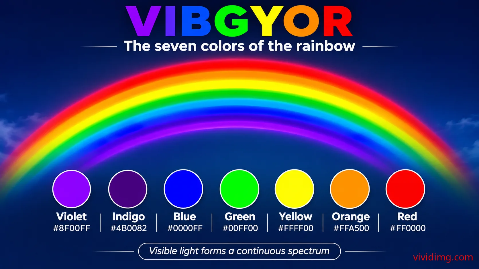
The traditional VIBGYOR sequence places blue after violet and indigo and before green. The complete sequence is Violet, Indigo, Blue, Green, Yellow, Orange, and Red.
Natural visible light forms a continuous spectrum, so the boundaries between blue and neighboring colors are gradual rather than sharply separated.
It is also important to distinguish physical spectral blue from the digital reference #0000FF. The HEX code identifies a color in the sRGB display system. It does not uniquely specify a wavelength of light. Different spectral distributions can produce similar perceived blue colors.
Why the sky appears blue
One of the most familiar examples of blue in nature is the daytime sky. The sky appears blue primarily because of Rayleigh scattering, a physical process in which molecules and very small particles in the atmosphere scatter shorter wavelengths of sunlight more strongly than longer wavelengths.
Blue light is scattered efficiently throughout the atmosphere, causing the sky to appear blue when viewed away from the direct Sun. Although violet wavelengths can be scattered even more strongly, the observed sky color depends on the solar spectrum, atmospheric absorption, and the wavelength sensitivity of human vision.
During sunrise and sunset, sunlight travels through a longer atmospheric path. More short-wavelength light is scattered out of the direct beam, allowing warmer red and orange colors to become more prominent.
This natural phenomenon demonstrates how the appearance of colors depends on light, matter, and human perception.
Why oceans and large bodies of water appear blue
Large bodies of water often appear blue because water absorbs longer visible wavelengths, particularly toward the red region, more strongly than shorter blue wavelengths. The appearance is also influenced by the reflection of the sky, scattering within the water, depth, suspended particles, and the surrounding environment.
Shallow water may appear turquoise or green, while deeper water can appear dark blue. These variations depend on the optical properties of the water and the conditions under which it is observed.
The blue appearance of oceans therefore involves more than simply reflecting the blue sky. Water itself has wavelength-dependent absorption characteristics that contribute to its color.
Blue in the HSL color model
HSL stands for Hue, Saturation, and Lightness. Hue describes a position around the RGB-derived color wheel, saturation describes the intensity of the color, and lightness represents its position between black and white within the HSL model.
Pure blue #0000FF has an HSL representation of (240°, 100%, 50%). The hue angle of 240° identifies the conventional pure blue position on the RGB hue wheel.
The saturation value of 100% indicates maximum saturation in the HSL model. The lightness value of 50% places pure blue at the midpoint of the HSL lightness scale.
However, HSL lightness is not equivalent to physical luminance or perceived brightness. Pure blue can appear substantially darker than pure yellow even though both colors have an HSL lightness value of 50%.
Blue in the HSV and HSB color models
HSV stands for Hue, Saturation, and Value. HSB uses the same general model, with B representing brightness.
Pure blue #0000FF has an HSV representation of (240°, 100%, 100%). Its hue is 240°, saturation is 100%, and value is 100% because the blue RGB channel is at its maximum intensity.
The HSV value of 100% does not mean pure blue has the same perceived brightness as white. It indicates that the maximum RGB channel value is at its highest possible level.
HSL and HSV are convenient for digital color selection, but they are not perceptually uniform models. More advanced color systems are useful when consistent perceived lightness and color differences are required.
Blue color temperature and visual characteristics
Blue is generally classified as a cool color. Cool colors are commonly associated with calmness, distance, depth, water, and open spaces.
The featured #0000FF blue is highly saturated and visually intense. Its strong chromatic appearance makes it suitable for educational graphics, attention-grabbing accents, and bold digital compositions.
Blue can also have warmer or cooler variations. Blue shades that shift toward cyan may feel different from shades that shift toward violet. Surrounding colors, lighting, and visual context influence how these variations are perceived.
Because pure blue is particularly intense on digital displays, designers often use softer or darker blue shades for large interface areas while reserving fully saturated blue for specific accents.
Blue color psychology and symbolism
Blue is commonly associated with trust, stability, intelligence, calmness, confidence, professionalism, and reliability. These associations contribute to its popularity in technology, financial services, healthcare, education, and corporate branding.
Lighter blues can create an open, peaceful atmosphere, while darker blues often communicate seriousness, sophistication, and authority. Highly saturated electric blues can convey energy, innovation, and modernity.
Blue may also be associated with sadness, coldness, or emotional distance in some contexts. Color meanings vary across cultures and situations, so designers should consider audience expectations and surrounding visual elements.
Color psychology is best understood as a collection of common associations rather than a universal set of rules.
Popular shades and variations of blue
Blue includes a broad range of shades, tints, and tones. Some are pale and delicate, while others are deep, muted, or intensely saturated.
Representative digital blue shades include:
Pure blue: #0000FF
Navy blue: #000080
Royal blue: #4169E1
Medium blue: #0000CD
Dodger blue: #1E90FF
Deep sky blue: #00BFFF
Sky blue: #87CEEB
Light blue: #ADD8E6
Steel blue: #4682B4
Cornflower blue: #6495ED
Midnight blue: #191970
Powder blue: #B0E0E6
These colors demonstrate how the blue family can vary in hue, saturation, and lightness. The featured infographic uses pure blue #0000FF as its reference rather than any of these alternative shades.
Blue color combinations and matching palettes
Blue can be combined with neutral colors, warm contrasting colors, analogous hues, and complementary accents. The most effective combination depends on the desired mood, readability, and visual hierarchy.
Useful blue color combinations include:
Blue and white: #0000FF + #FFFFFF — Clean, bright appearance
Blue and black: #0000FF + #000000 — Bold dramatic styling
Blue and light gray: #0000FF + #D3D3D3 — Modern minimalist palette
Blue and yellow: #0000FF + #FFFF00 — Strong complementary contrast
Blue and orange: #0000FF + #FFA500 — Energetic warm-cool combination
Blue and cyan: #0000FF + #00FFFF — Cool analogous harmony
Blue and violet: #0000FF + #8F00FF — Rich neighboring hues
Blue and green: #0000FF + #00FF00 — Vibrant cool-color combination
Blue and silver: #0000FF + #C0C0C0 — Contemporary metallic-inspired styling
Blue and gold: #0000FF + #FFD700 — Bold decorative contrast
These combinations are visual palette suggestions rather than physical pigment-mixing equations. Their effectiveness depends on color proportions, typography, surrounding elements, and accessibility requirements.
What is the complementary color of blue?
In the conventional RGB-derived HSL color wheel, pure blue has a hue angle of 240°. Its complementary hue is located 180° opposite, at 60°, corresponding to yellow.
The direct HSL complementary color of pure blue #0000FF is therefore yellow #FFFF00.
Complementary colors create strong hue contrast and are often used to emphasize important elements in graphic design. However, complementary relationships depend on the color model. Traditional RYB color wheels commonly associate blue with orange as a complementary pair.
Both blue-yellow and blue-orange combinations can be visually effective, but they represent different color-wheel conventions.
Blue in additive and subtractive color mixing
In additive RGB light mixing, blue is a primary color. Combining blue and green light produces cyan, while combining blue and red light produces magenta. Combining all three RGB primaries at suitable maximum levels produces white.
In subtractive CMY color mixing, cyan, magenta, and yellow are the principal colorants in the simplified model. Blue-family colors can be produced by combining cyan and magenta colorants, although actual results depend on the inks, pigments, substrate, and color-management system.
In traditional RYB painting, blue is treated as a primary color and is commonly mixed with yellow to create green or red to create violet and purple-family colors.
These different systems demonstrate why the meaning of primary color depends on whether the discussion concerns emitted light, printing inks, or traditional painting.
Accessibility and text contrast on pure blue backgrounds
Pure blue #0000FF has an approximate relative luminance of 0.0722 in the sRGB color space. Its contrast ratio against pure white #FFFFFF is approximately 8.59:1.
Against pure black #000000, the contrast ratio is approximately 2.44:1.
Under WCAG 2.x AA criteria, normal text generally requires a contrast ratio of at least 4.5:1, while large text generally requires at least 3:1. White text on pure blue meets both contrast thresholds, while black text on pure blue does not meet either threshold.
This makes white a strong text-color choice for the featured pure blue background. However, designers should also consider font size, weight, spacing, and viewing conditions when evaluating readability.
The infographic uses large white typography and a dark navy information panel to maintain strong visual contrast and clear organization.
Using blue in websites and user interface design
Blue is one of the most frequently used colors in web and application design. It is commonly used for hyperlinks, buttons, navigation elements, information messages, charts, branding, and interactive components.
Pure blue #0000FF is a traditional digital reference, but many modern interfaces use adjusted blue shades to improve visual comfort and maintain consistent design systems.
Blue backgrounds can work well in educational websites, technology presentations, dashboards, promotional graphics, and creative portfolios. White or appropriately contrasting light text can provide clear readability against darker and more saturated blue surfaces.
Designers should avoid relying on blue alone to communicate essential information. Links and interactive elements should also use appropriate visual indicators, such as underlines, labels, or recognizable interface patterns.
CSS examples for pure blue backgrounds
Web developers can recreate the featured blue using HEX notation, RGB values, HSL values, or the predefined CSS keyword.
/* Pure blue background */
.blue-background {
  background-color: #0000FF;
  color: #FFFFFF;
}

/* Equivalent RGB representation */
.blue-rgb {
  background-color: rgb(0, 0, 255);
}

/* Equivalent HSL representation */
.blue-hsl {
  background-color: hsl(240, 100%, 50%);
}

/* CSS named color */
.blue-keyword {
  background-color: blue;
}

/* Reusable CSS variables */
:root {
  --color-blue: #0000FF;
  --color-white: #FFFFFF;
  --color-navy: #001F3F;
  --color-cyan: #00FFFF;
  --color-yellow: #FFFF00;
}

.blue-panel {
  background-color: var(--color-blue);
  color: var(--color-white);
}

/* Decorative blue gradient */
.blue-gradient {
  background: linear-gradient(
    135deg,
    #000080 0%,
    #0000FF 50%,
    #00BFFF 100%
  );
}
The gradient example demonstrates a possible creative application using navy blue, pure blue, and deep sky blue. It is separate from the solid pure blue background shown in the educational infographic.
Blue in photography, fashion and interior design
Blue is widely used in photography to represent skies, water, atmospheric depth, and cool lighting. Photographers frequently work with blue tones during twilight and the period commonly called blue hour, when indirect natural light can create cool-colored scenes.
In fashion, blue appears in denim, formal clothing, casual wear, accessories, and traditional textiles. Navy blue is particularly popular for professional clothing, while brighter blues can create energetic and expressive combinations.
In interior design, blue can be used for walls, furniture, textiles, decorative accents, and lighting. Pale blues often create an airy appearance, while darker blues can add depth and sophistication.
In branding, blue is frequently chosen for its familiar associations with reliability, professionalism, and clarity. However, effective branding depends on more than color alone, including typography, imagery, consistency, and audience expectations.
Understanding the pure blue educational infographic
The image features a vivid solid blue background representing #0000FF. A large white BLUE heading appears in the upper-left corner, followed by a thin white underline and a dark navy rounded classification label reading Spectral color / cool color family.
A wide dark navy information panel occupies the lower portion of the composition. On the left, a circular pure blue swatch outlined in white identifies the featured color.
The central specification table displays HEX #0000FF, RGB (0, 0, 255), HSL (240°, 100%, 50%), HSV (240°, 100%, 100%), the blue color family, and cool temperature classification.
On the right, a bordered educational statement explains that blue is a primary color of RGB light. Beneath it, a supporting sentence states that blue light occupies approximately 450–495 nanometers of the visible spectrum.
The composition intentionally leaves a large uninterrupted blue area visible above the information panel. This allows viewers to appreciate the featured color directly while keeping the educational information clearly organized.
The infographic focuses exclusively on blue and its relevant properties without adding lesson numbers, unrelated decorative graphics, or unnecessary visual elements.
Blue and its relationship with VIBGYOR
Blue is the third color in the traditional VIBGYOR mnemonic, following violet and indigo and preceding green. The complete sequence is Violet, Indigo, Blue, Green, Yellow, Orange, and Red.
In a primary rainbow, blue appears between green and the violet-indigo region when viewed from the outer red edge toward the inner violet edge.
Blue provides an important connection between rainbow color education and digital color science because it is both a recognizable spectral color family and a primary component of RGB light mixing.
Understanding blue establishes useful foundations for exploring cyan, green, violet, color harmonies, complementary colors, digital displays, and more advanced color combinations.
Continue exploring the Color Backgrounds collection
This pure blue color reference is part of the VividImg Color Backgrounds educational collection, which explores colors progressively from foundational concepts to advanced color relationships and creative applications.
The collection begins with an introduction to VIBGYOR and neutral colors such as white, black, and gray. It then examines individual chromatic colors, their technical values, scientific characteristics, color families, shades, tints, tones, mixing methods, gradients, textures, and advanced color theory.
Pure blue introduces essential concepts including RGB primary colors, additive light mixing, spectral wavelengths, color saturation, complementary hues, and digital color representation.
Explore the Color Backgrounds collection on VividImg to discover educational color references, practical HEX and RGB codes, visually engaging backgrounds, and detailed explanations for students, teachers, designers, developers, photographers, and creative enthusiasts.
Image statistics
Loading statistics…Top 5 countries
— countries reached · all time
Country data will appear as views are recorded.
Daily views
Last 12 months
- —
- Unique visitors
- —
- Card clicks
- —
- Downloads
- —
- Share actions