Shareable Image
Violet color background with HEX code, RGB values and color meaning
Violet color background with HEX code, RGB values and color meaning
Violet color background with HEX code, RGB values and color meaning explores one of the most fascinating colors in the visible spectrum. This vibrant educational infographic introduces violet through a vivid digital background, a clearly labeled color swatch, technical color values, and a scientific explanation of its relationship with visible light. Represented by the hexadecimal code #8F00FF, the featured violet is a highly saturated digital color commonly associated with creativity, imagination, individuality, artistic expression, and visual sophistication.
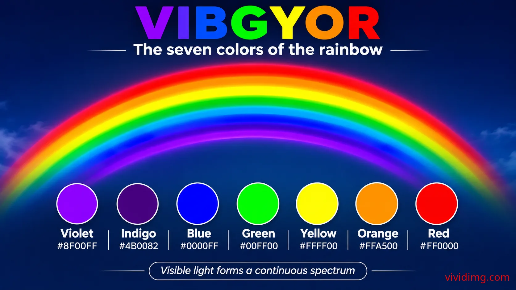
Violet is traditionally recognized as the first color in VIBGYOR, the mnemonic representing Violet, Indigo, Blue, Green, Yellow, Orange, and Red. It occupies the short-wavelength end of the visible spectrum and plays an important role in understanding rainbow colors, color perception, digital color systems, and the relationship between spectral colors and screen-generated colors.
The infographic features a vivid violet background with a large white VIOLET heading, a classification label reading Spectral color / cool color family, and a dark navy information panel along the lower portion. The panel displays the representative digital values of violet and explains why a hexadecimal color code cannot uniquely identify a physical wavelength of light.
What is violet?
Violet is a spectral color associated with the shortest wavelengths of visible light. It appears near the inner edge of a primary rainbow, following indigo in the traditional seven-color classification when moving from the outer red band toward the inner violet band.
The visible violet region is commonly described as extending approximately from 380 to 450 nanometers, although the exact boundaries vary between scientific references and color classification systems. Violet gradually transitions toward blue at longer wavelengths, while wavelengths shorter than the visible violet region enter the ultraviolet portion of the electromagnetic spectrum.
Unlike white, black, and neutral gray, violet is a chromatic color because it has an identifiable hue and measurable saturation. It is generally classified within the cool color family, although its visual temperature can be influenced by surrounding colors and its balance of reddish and bluish components.
Violet color technical specifications
Color name: Violet
Reference HEX code: #8F00FF
RGB: (143, 0, 255)
HSL: Approximately (274°, 100%, 50%)
HSV / HSB: Approximately (274°, 100%, 100%)
CMYK: Approximately (44%, 100%, 0%, 0%) using a simplified mathematical conversion
Color family: Violet
Color classification: Chromatic color
Spectral association: Short-wavelength visible light
Approximate violet wavelength region: 380–450 nm
Color temperature: Cool
Digital saturation: 100% in HSL and HSV
HSV brightness: 100%
Reference color space: sRGB
These technical values describe the specific digital violet represented by #8F00FF. They do not define every possible shade of violet or establish an exact wavelength for the displayed color. Different digital violet shades can have different RGB, HSL, HSV, and CMYK values.
The CMYK values are approximate and should not be treated as a universal printing formula. Accurate printed colors depend on ink, paper, printer calibration, and the applicable ICC color profile.
Understanding the violet HEX code #8F00FF
HEX color notation represents digital RGB colors using three pairs of hexadecimal characters. The first pair specifies the red channel, the second specifies green, and the third specifies blue. Each pair ranges from 00 to FF, corresponding to decimal values from 0 to 255.
For violet #8F00FF, the hexadecimal value 8F represents red at 143, 00 represents green at 0, and FF represents blue at 255. This combination produces a vivid violet appearance with a strong blue component and a substantial red component.
The equivalent RGB representation is rgb(143, 0, 255). The absence of green contributes to the saturated violet appearance, while the balance between red and blue determines its position within the digital color wheel.
It is important to distinguish the reference shade #8F00FF from the predefined CSS color keyword violet, which represents #EE82EE. Both are commonly described as violet, but they are different digital colors. The infographic specifically uses #8F00FF as its educational reference.
Understanding violet in the HSL color model
HSL stands for Hue, Saturation, and Lightness. Hue describes a position around a digital color wheel, saturation describes color intensity, and lightness describes the position between black and white within the HSL model.
The featured violet has an HSL representation of approximately 274°, 100%, 50%. Its hue angle places it between digital blue at 240° and magenta at 300°. The saturation value of 100% indicates maximum HSL saturation, while the lightness value of 50% places it at the fully saturated midpoint of the HSL lightness scale.
HSL lightness should not be confused with physical luminance or perceived brightness. Colors with identical HSL lightness values can appear significantly different in brightness because human vision responds differently to different spectral and RGB compositions.
Understanding violet in the HSV color model
HSV stands for Hue, Saturation, and Value. It is also called HSB, where B represents brightness. The featured violet has an approximate HSV representation of 274°, 100%, 100%.
The hue identifies its position within the digital color wheel. The saturation indicates that the color is fully saturated within the HSV model, while the value of 100% indicates that at least one RGB channel is at its maximum intensity.
Because the blue channel is 255, the HSV value reaches 100%. This does not mean the color has the same perceived brightness as white or yellow. HSV value is based on RGB channel magnitude rather than a perceptually uniform brightness measurement.
Violet and the visible light spectrum
Visible light forms part of the electromagnetic spectrum. Human vision typically detects wavelengths extending approximately from 380 to 700 nanometers, although the boundaries depend on individual sensitivity and viewing conditions.
Violet occupies the short-wavelength region of this range. Its wavelengths are shorter than those commonly associated with blue, green, yellow, orange, and red. As wavelength decreases beyond the violet region, electromagnetic radiation enters the ultraviolet range, which is generally outside ordinary human visual sensitivity.
The infographic highlights this relationship with the statement that violet lies at the short-wavelength end of the visible spectrum.
However, the digital color #8F00FF is not equivalent to a single violet wavelength. RGB displays create colors by combining emissions from red, green, and blue light sources. The displayed violet is produced through a mixture of red and blue channel contributions, rather than by emitting one uniquely defined spectral violet wavelength.
This distinction is essential for understanding the difference between spectral colors and digital approximations.
Why violet appears in the rainbow
A rainbow forms when sunlight interacts with water droplets in the atmosphere. Refraction, dispersion, and internal reflection separate sunlight into different visible wavelengths. Because different wavelengths are refracted by slightly different amounts, the observer perceives a continuous range of colors.
In a primary rainbow, red appears along the outer edge and violet appears toward the inner edge. The traditional VIBGYOR sequence begins with violet and ends with red, describing the rainbow colors from shorter to longer wavelengths.
Although educational diagrams commonly show seven distinct color bands, natural rainbows are continuous spectra. The boundaries between violet, indigo, blue, and other colors are not sharply separated in nature.
Violet versus purple: Understanding the difference
Violet and purple are often used interchangeably in everyday language, but they have an important distinction in color science. Spectral violet refers to light from the short-wavelength end of the visible spectrum. Purple generally refers to nonspectral colors perceived through combinations of reddish and bluish light.
A single wavelength can produce a violet sensation, while many digital purple and violet appearances are created by combining red and blue display primaries.
The reference color #8F00FF has strong red and blue RGB components. It is therefore best understood as a vivid digital violet approximation rather than a physically pure spectral violet.
Other commonly used digital colors in the violet and purple family include:
Violet reference: #8F00FF
CSS violet: #EE82EE
Blue violet: #8A2BE2
Dark violet: #9400D3
Dark orchid: #9932CC
Medium purple: #9370DB
Rebecca purple: #663399
Indigo: #4B0082
Lavender: #E6E6FA
These examples demonstrate how the violet family extends from pale lavender to rich, saturated blue-violet and deep purple shades.
Violet color temperature and visual characteristics
Violet is generally classified as a cool color because of its relationship with blue and the shorter-wavelength region of visible light. Cool colors are frequently associated with calmness, distance, depth, and reflective visual moods.
However, violet can also display warmer characteristics when its appearance shifts toward red or magenta. A blue-dominant violet often feels cooler, while a red-dominant violet may appear warmer or more energetic.
The reference shade #8F00FF is highly saturated and visually striking. Its strong blue component contributes to a cool appearance, while its red component adds vibrancy and richness.
Violet color psychology and symbolism
Violet is commonly associated with creativity, imagination, individuality, mystery, spirituality, luxury, and artistic expression. Historically, purple and violet dyes were sometimes associated with wealth and status because certain pigments and dyes were difficult or expensive to produce.
In modern design, violet is frequently used to communicate originality, creativity, innovation, and a distinctive visual identity. It appears in beauty branding, artistic portfolios, entertainment graphics, technology products, and digital illustrations.
These associations are contextual rather than universal. The meaning of violet can vary across cultures, historical periods, industries, and individual experiences. Designers should consider audience expectations and surrounding visual elements when selecting violet for communication.
Violet color combinations and matching palettes
Violet can be combined with neutral colors, analogous hues, complementary hues, and contrasting accent colors. The most suitable combination depends on the intended mood, visual hierarchy, and accessibility requirements.
Useful violet color combinations include:
Violet and white: #8F00FF + #FFFFFF — Clean, vibrant contrast
Violet and black: #8F00FF + #000000 — Bold dramatic appearance
Violet and navy: #8F00FF + #001F3F — Rich contemporary styling
Violet and lavender: #8F00FF + #E6E6FA — Soft monochromatic harmony
Violet and blue violet: #8F00FF + #8A2BE2 — Closely related cool hues
Violet and magenta: #8F00FF + #FF00FF — Energetic analogous appearance
Violet and lime green: #8F00FF + #70FF00 — Strong complementary-style contrast
Violet and gold: #8F00FF + #FFD700 — Vibrant decorative contrast
Violet and silver: #8F00FF + #C0C0C0 — Modern metallic-inspired styling
In the conventional RGB hue-wheel model, the complementary hue opposite approximately 274° is approximately 94°, which lies in the yellow-green region. A digital complementary reference can therefore be approximated by #70FF00.
Complementary relationships depend on the color model being used. Traditional artistic color wheels and modern RGB hue wheels do not always identify exactly the same opposing colors.
Violet in traditional painting and digital color mixing
Traditional RYB art education commonly teaches that violet or purple can be created by combining red and blue pigments. However, the resulting color depends on the actual pigments, their absorption characteristics, and the mixing proportions. Some red and blue paint combinations produce muted purple, dark gray, or brownish results rather than a vivid violet.
In additive RGB light mixing, red and blue light combine to create magenta or purple-family colors. The exact appearance depends on the relative intensities of the two channels.
The reference violet #8F00FF uses red at 143, green at 0, and blue at 255. This produces a blue-dominant violet appearance within the sRGB color space.
Physical spectral violet, traditional pigment violet, and digital RGB violet should therefore be treated as related but distinct concepts.
Accessibility and text contrast on violet backgrounds
Violet backgrounds can create visually attractive interfaces, but text readability depends on sufficient contrast. The reference violet #8F00FF has an approximate sRGB relative luminance of 0.151.
Its approximate contrast ratio against pure white #FFFFFF is 5.22:1. Against pure black #000000, the contrast ratio is approximately 4.02:1.
Under WCAG 2.x AA criteria, normal text generally requires a contrast ratio of at least 4.5:1, while large text generally requires at least 3:1. White text on the reference violet therefore meets the normal-text AA contrast threshold, while black text does not meet that particular threshold.
These calculations apply to the specified digital colors. Real readability also depends on typography, font weight, text size, surrounding elements, and viewing conditions.
The infographic uses large white typography and a dark navy information panel to create visual separation and maintain readable educational content.
Using violet in websites and graphic design
Violet is widely used in website backgrounds, application interfaces, branding, presentations, social media graphics, and digital artwork. Its vivid appearance makes it suitable for attention-grabbing hero sections, promotional graphics, creative portfolios, and decorative design elements.
Violet can also serve as an accent color for buttons, icons, headings, and illustrations. When used across a large background area, designers should balance saturation with readable typography and sufficient spacing.
For professional interfaces, violet often works well with white, deep navy, charcoal, lavender, and muted neutral colors. These combinations can preserve the personality of violet while keeping layouts organized and readable.
CSS examples for the violet reference color
Web developers can recreate the featured violet background using the HEX code #8F00FF or its equivalent RGB and HSL values.
/* Featured violet background */
.violet-background {
  background-color: #8F00FF;
  color: #FFFFFF;
}

/* Equivalent RGB representation */
.violet-rgb {
  background-color: rgb(143, 0, 255);
}

/* Approximate HSL representation */
.violet-hsl {
  background-color: hsl(274, 100%, 50%);
}

/* Reusable CSS variables */
:root {
  --color-violet: #8F00FF;
  --color-white: #FFFFFF;
  --color-navy: #001F3F;
  --color-lavender: #E6E6FA;
}

.violet-panel {
  background-color: var(--color-violet);
  color: var(--color-white);
}

/* Decorative violet gradient */
.violet-gradient {
  background: linear-gradient(
    135deg,
    #4B0082 0%,
    #8F00FF 55%,
    #E6E6FA 100%
  );
}
The gradient example demonstrates a possible design application using indigo, violet, and lavender. It is not the solid background shown in the educational infographic. The primary reference color remains #8F00FF.
Violet in nature, fashion and creative applications
Violet and purple-family colors appear in many flowers, fruits, minerals, textiles, and artistic materials. Examples include violets, certain orchids, lavender flowers, amethyst gemstones, and various naturally pigmented plants.
The appearance of these objects depends on pigments, structural coloration, lighting, and surface properties. Natural violet objects do not necessarily match the digital HEX reference #8F00FF.
In fashion, violet can create expressive clothing combinations and sophisticated accessories. In interior design, deeper violet shades can produce dramatic accents, while lighter lavender tones can create softer environments.
In digital art, violet is frequently used in fantasy scenes, abstract compositions, atmospheric lighting, and futuristic illustrations because it can produce strong visual depth and contrast.
Understanding the violet educational infographic
The image presents a vivid solid violet background with a large white VIOLET heading positioned near the upper-left corner. A thin white underline separates the heading from a rounded dark navy classification label reading Spectral color / cool color family.
The lower information panel uses a dark navy background with white outlines and typography. On the left, a circular violet swatch identifies the featured color. The central technical table displays HEX #8F00FF, RGB (143, 0, 255), HSL approximately (274°, 100%, 50%), HSV approximately (274°, 100%, 100%), the violet color family, and cool temperature classification.
The right side contains the scientific explanation Violet lies at the short-wavelength end of the visible spectrum. A supporting statement clarifies that the HEX value is a digital approximation rather than a unique spectral wavelength.
The design preserves a large uninterrupted violet area above the information panel, allowing the featured color to remain visually dominant. The white typography and navy information panel create a consistent educational layout while keeping the focus on the color itself.
Violet and its relationship with VIBGYOR
Violet is the first color in the traditional VIBGYOR mnemonic. The seven colors are Violet, Indigo, Blue, Green, Yellow, Orange, and Red. This sequence describes the conventional rainbow colors from shorter to longer visible wavelengths.
In a primary rainbow, violet appears toward the inner edge, while red appears along the outer edge. Between these endpoints lies a continuous spectrum of visible light.
Understanding violet helps introduce spectral wavelengths, chromatic colors, saturation, digital color approximation, and the distinction between physical light and RGB display colors.
Continue exploring the Color Backgrounds collection
This violet color reference is part of the VividImg Color Backgrounds educational collection, which explores colors progressively from fundamental concepts to advanced color relationships and creative applications.
The collection begins with an introduction to VIBGYOR and foundational neutral colors, including white, black, and gray. It then explores individual chromatic colors, their technical specifications, color families, shades, tints, tones, mixing methods, gradients, textures, and advanced color science.
Violet provides an important introduction to the short-wavelength region of the visible spectrum. Its relationship with indigo and blue creates a natural foundation for understanding neighboring hues and the gradual transitions found in rainbow colors.
Explore the Color Backgrounds collection on VividImg to discover educational color references, practical HEX and RGB codes, detailed color explanations, and visually engaging backgrounds for students, teachers, designers, developers, and creative enthusiasts.
Image statistics
Loading statistics…Top 5 countries
— countries reached · all time
Country data will appear as views are recorded.
Daily views
Last 12 months
- —
- Unique visitors
- —
- Card clicks
- —
- Downloads
- —
- Share actions