Shareable Image
Pure red color background with HEX code, RGB values and color meaning
Pure red color background with HEX code, RGB values and color meaning
Pure red color background with HEX code, RGB values and color meaning explores one of the most powerful, recognizable, and visually striking colors in the visible spectrum. Represented by the hexadecimal code #FF0000, pure red is a fully saturated digital color and one of the three primary colors of the RGB light model. Red is widely associated with love, passion, energy, excitement, strength, courage, celebration, urgency, and attention. Its bold appearance makes it an important color in graphic design, digital technology, branding, photography, fashion, art, and everyday visual communication.
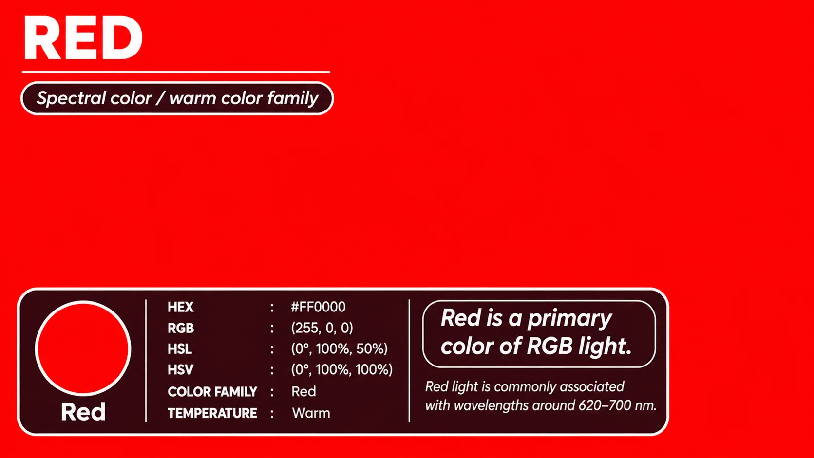
This educational infographic features a vivid red background with a large white RED heading, a classification label identifying red as a spectral color belonging to the warm color family, and a dark maroon information panel. The panel displays a circular red swatch, technical color specifications, and a concise explanation of red's role as a primary color of RGB light. It also introduces the approximate wavelength region associated with red light, connecting digital color representation with the science of the visible spectrum.
Understanding red provides an important foundation for learning how digital displays produce colors, how pigments interact with light, how colors influence visual communication, and why different shades of red create different impressions.
What is red?
Red is a chromatic color associated with the long-wavelength region of the visible light spectrum. It is generally classified as a warm color because of its familiar associations with fire, warmth, sunsets, and energetic environments.
Red light is commonly associated with wavelengths of approximately 620–700 nanometers, although the boundaries vary between scientific references. Human vision can detect some wavelengths beyond 700 nanometers under suitable conditions, so this interval should be understood as an approximate educational classification rather than a strict physical limit.
The specific red featured in this infographic is #FF0000, commonly called pure red or RGB red. It represents the maximum red channel value with zero green and blue contributions in the standard RGB color model.
Red is a primary color in both the RGB additive light model and the traditional RYB painting model. It is also the final color in the traditional VIBGYOR sequence.
Pure red technical color specifications
Color name: Red
Reference shade: Pure red / RGB red
HEX code: #FF0000
RGB: (255, 0, 0)
HSL: (0°, 100%, 50%)
HSV / HSB: (0°, 100%, 100%)
CMYK: Approximately (0%, 100%, 100%, 0%) using a simplified mathematical conversion
Color family: Red
Color classification: Chromatic / spectral color family
Color temperature: Warm
RGB color model: Primary color
Traditional RYB color model: Primary color
Traditional VIBGYOR position: Seventh
Approximate red wavelength region: 620–700 nm
HSL saturation: 100%
HSV value: 100%
Relative luminance: Approximately 0.2126 in sRGB
Reference color space: sRGB
CSS color keyword: red
These values describe the specific digital color #FF0000 rather than every shade of red. The CMYK representation is a simplified mathematical approximation, not a guaranteed printing specification. Actual printed colors depend on ink characteristics, paper, printing technology, ICC profiles, and color-management settings.
Understanding the red HEX code #FF0000
Hexadecimal color notation is widely used in web development, graphic design, image editing, and digital applications. A standard six-digit HEX color code contains three pairs of hexadecimal characters representing the red, green, and blue channels.
Each channel ranges from hexadecimal 00 to FF, corresponding to decimal values from 0 to 255.
In the code #FF0000, the first FF represents red at its maximum value of 255. The second 00 represents green at zero, and the final 00 represents blue at zero.
This produces a fully saturated digital red with no green or blue channel contribution.
Equivalent representations include:
HEX: #FF0000
Short HEX: #F00
RGB: rgb(255, 0, 0)
HSL: hsl(0, 100%, 50%)
HSV: (0°, 100%, 100%)
CSS keyword: red
These representations identify the same nominal pure red color within the standard sRGB color space.
Red as a primary color in RGB light
RGB stands for Red, Green, and Blue. It is an additive color model used by computer monitors, smartphones, televisions, projectors, and many other electronic displays.
Red is one of the three primary light channels in the RGB model. Different combinations of red, green, and blue light allow digital displays to reproduce a broad range of perceived colors.
Important additive RGB combinations include:
Red + Green = Yellow
Red + Blue = Magenta
Green + Blue = Cyan
Red + Green + Blue at maximum intensity = White
All RGB channels at zero = Black
These relationships describe idealized additive light mixing rather than physical pigment mixing. The exact perceived colors depend on the characteristics of the display primaries and the color space being used.
The infographic emphasizes this fundamental principle with the statement that red is a primary color of RGB light.
Red in traditional RYB painting
Traditional art education commonly introduces red, yellow, and blue as the three primary colors of the RYB painting model.
In this system, red is treated as a primary pigment color. Red and yellow paints are commonly mixed to create orange-family colors, while red and blue paints can produce violet or purple-family mixtures.
Actual pigment mixing depends on the chemical composition, spectral absorption, transparency, concentration, and proportions of the paints involved.
Different red pigments may produce very different results when mixed with the same blue or yellow pigment. Some combinations create bright colors, while others produce muted or darker mixtures.
Understanding this distinction helps explain why color mixing behaves differently in traditional painting and digital RGB displays.
Red and the visible light spectrum
Visible light is electromagnetic radiation that the human visual system can detect. The visible spectrum is commonly described as extending approximately from 380 to 700 nanometers, although its precise boundaries depend on observing conditions and individual sensitivity.
Red occupies the long-wavelength region of the visible spectrum, commonly associated with wavelengths around 620–700 nanometers.
In the traditional VIBGYOR sequence, red appears after violet, indigo, blue, green, yellow, and orange.
Natural visible light forms a continuous spectrum, so the boundary between orange and red is gradual rather than sharply separated.
The digital color #FF0000 does not correspond to one unique wavelength of light. It identifies a particular RGB color value, while the actual spectral distribution of light emitted by a display depends on its technology.
Different spectral distributions can produce similar perceived red colors, demonstrating the relationship between physical light and human color perception.
Why sunsets and sunrises appear red
Red is strongly associated with sunsets and sunrises because of atmospheric scattering.
When the Sun is close to the horizon, sunlight travels through a longer path in Earth's atmosphere. Shorter wavelengths, especially blue and violet, are scattered more strongly out of the direct beam.
As a result, longer-wavelength colors such as orange and red can become more prominent in the sunlight reaching an observer.
Atmospheric particles, aerosols, dust, clouds, and local weather conditions can influence the intensity and appearance of these colors.
This phenomenon demonstrates how the observed color of light depends on its spectral composition and interaction with the atmosphere.
Why many objects appear red
Objects appear red when the light reaching our eyes from them produces a red color sensation. Under ordinary white illumination, many red surfaces absorb substantial portions of shorter-wavelength visible light while reflecting relatively more light from the red region.
The exact appearance depends on the object's pigments, surface structure, illumination, and viewing conditions.
Red pigments occur in many natural materials, including certain flowers, fruits, minerals, and biological tissues.
For example, the red appearance of ripe tomatoes is strongly associated with lycopene, a carotenoid pigment. Red flowers may contain anthocyanins or other pigments, depending on the species.
These examples demonstrate how color results from interactions between light, materials, and human vision.
Red in the HSL color model
HSL stands for Hue, Saturation, and Lightness. Hue identifies a position around the RGB-derived color wheel, saturation describes color intensity, and lightness represents the position between black and white within the HSL model.
Pure red #FF0000 has an HSL representation of (0°, 100%, 50%).
The hue angle of 0° identifies the conventional pure red position on the RGB color wheel. Because the hue wheel is circular, 360° represents the same hue direction as 0°.
The saturation value of 100% indicates maximum saturation in the HSL model, while the lightness value of 50% places pure red at the fully saturated midpoint of the HSL lightness scale.
HSL lightness should not be confused with physical luminance or perceived brightness. Colors with the same HSL lightness can appear substantially different in brightness.
Red in the HSV and HSB color models
HSV stands for Hue, Saturation, and Value. HSB is another name for the same general model, using brightness instead of value.
Pure red #FF0000 has an HSV representation of (0°, 100%, 100%).
Its hue is 0°, saturation is 100%, and value is 100% because the red RGB channel is at its maximum intensity.
The HSV value of 100% does not mean pure red has the same physical luminance or perceived brightness as white. It indicates that the maximum RGB channel value is at its highest possible level.
HSL and HSV are convenient models for selecting and adjusting digital colors, but they are not perceptually uniform color spaces.
Red color temperature and visual characteristics
Red is generally classified as a warm color because of its associations with fire, heat, sunlight, and energetic visual environments.
The featured #FF0000 is highly saturated, vivid, and visually intense. Its strong chromatic appearance makes it suitable for educational graphics, attention-grabbing accents, and bold digital compositions.
Red can shift toward orange or magenta depending on its hue. Orange-red shades often feel warmer, while magenta-red shades may appear comparatively cooler.
Because pure red can dominate a visual composition, designers frequently balance it with neutral colors, dark backgrounds, or softer complementary accents.
Red color psychology and symbolism
Red is commonly associated with love, passion, excitement, energy, confidence, courage, strength, and celebration.
It is also widely used to represent danger, urgency, warnings, errors, or prohibited actions in visual communication.
In many cultural traditions, red has important associations with weddings, festivals, prosperity, good fortune, and ceremonial clothing.
In other contexts, red can represent anger, conflict, or emotional intensity.
These meanings depend on culture, context, personal experience, and surrounding visual elements. Color psychology is best understood as a collection of common associations rather than universal rules.
Popular shades and variations of red
The red color family includes bright, dark, muted, pinkish, orange-toned, and purple-toned variations.
Representative digital red shades include:
Pure red: #FF0000
Dark red: #8B0000
Maroon: #800000
Crimson: #DC143C
Firebrick: #B22222
Indian red: #CD5C5C
Tomato: #FF6347
Orange red: #FF4500
Light coral: #F08080
Salmon: #FA8072
Dark salmon: #E9967A
Deep pink: #FF1493
Rosy brown: #BC8F8F
These examples demonstrate how red can vary in hue, saturation, and lightness. The featured infographic uses pure RGB red #FF0000 as its primary reference.
Red color combinations and matching palettes
Red can be combined with neutral colors, analogous warm hues, complementary colors, and contrasting cool shades.
Useful red combinations include:
Red and white: #FF0000 + #FFFFFF — Bold, clean appearance
Red and black: #FF0000 + #000000 — Dramatic styling
Red and navy: #FF0000 + #001F3F — Strong contemporary contrast
Red and yellow: #FF0000 + #FFFF00 — Energetic warm-color palette
Red and orange: #FF0000 + #FFA500 — Warm analogous harmony
Red and cyan: #FF0000 + #00FFFF — Strong complementary hue contrast
Red and green: #FF0000 + #00FF00 — Vibrant RGB-primary combination
Red and gray: #FF0000 + #808080 — Balanced modern palette
Red and gold: #FF0000 + #FFD700 — Festive decorative styling
Red and cream: #FF0000 + #FFFDD0 — Softer warm-neutral combination
These are visual palette suggestions rather than physical pigment-mixing equations. Their effectiveness depends on color proportions, typography, contrast, and surrounding design elements.
What is the complementary color of red?
In the conventional RGB-derived HSL color wheel, pure red has a hue angle of 0°. Its complementary hue lies 180° opposite, corresponding to cyan.
The direct HSL complementary color of pure red #FF0000 is cyan #00FFFF.
Complementary colors create strong hue contrast and are frequently used to emphasize important elements in graphic design.
However, complementary relationships depend on the color model. Traditional RYB color wheels commonly associate red with green as a complementary pair.
Both red-cyan and red-green combinations can create strong visual contrasts, but they represent different color-wheel conventions.
Red in additive and subtractive color mixing
In additive RGB light mixing, red is a primary color. Combining red and green light produces yellow, while combining red and blue light produces magenta.
Combining all three RGB primary channels at suitable maximum intensities produces white.
In the simplified CMY subtractive model, red-family colors can be produced by combining magenta and yellow colorants. Actual results depend on the inks, pigments, substrate, and color-management process.
In traditional RYB painting, red is considered a primary pigment color and is commonly mixed with yellow to create orange or blue to create violet and purple-family colors.
These different systems demonstrate why color creation depends on whether the medium involves emitted light, reflected light, printing inks, or physical pigments.
Accessibility and text contrast on pure red backgrounds
Pure red #FF0000 has an approximate relative luminance of 0.2126 in the sRGB color space.
Its contrast ratio against pure black #000000 is approximately 5.25:1. Against pure white #FFFFFF, the contrast ratio is approximately 4.00:1.
Under WCAG 2.x AA criteria, normal text generally requires a minimum contrast ratio of 4.5:1, while large text generally requires at least 3:1.
Black text on pure red meets the AA contrast requirement for normal and large text. White text on pure red meets the AA requirement for large text but does not meet the 4.5:1 requirement for normal-sized text.
For small text on red backgrounds, designers should select a darker text color or adjust the red background to achieve the required contrast.
The infographic uses large white typography against the vivid red background and places smaller technical information inside a dark maroon panel for clearer separation.
Important warnings and status messages should never rely on red alone. Text labels, icons, and additional visual indicators help make interfaces more accessible.
Using red in websites and user interface design
Red is widely used in websites and applications for error messages, alerts, notifications, promotional banners, destructive action buttons, important indicators, and branding.
Pure red #FF0000 is particularly intense and can dominate a large interface area. Designers often use darker or more muted red shades for extended reading and reserve vivid red for specific accents.
Red can also be used effectively in charts and dashboards, especially when paired with clear labels and accessible visual indicators.
When designing interactive elements, developers should verify contrast ratios, focus indicators, hover states, and visual hierarchy.
Red should be used consistently so users can understand its meaning within a particular interface.
CSS examples for pure red backgrounds
Web developers can recreate the featured red using HEX notation, RGB values, HSL values, or the predefined CSS keyword.
/* Pure red background */
.red-background {
  background-color: #FF0000;
  color: #000000;
}

/* Equivalent RGB representation */
.red-rgb {
  background-color: rgb(255, 0, 0);
}

/* Equivalent HSL representation */
.red-hsl {
  background-color: hsl(0, 100%, 50%);
}

/* CSS named color */
.red-keyword {
  background-color: red;
}

/* Reusable CSS variables */
:root {
  --color-red: #FF0000;
  --color-dark-red: #8B0000;
  --color-crimson: #DC143C;
  --color-white: #FFFFFF;
  --color-black: #000000;
}

.red-panel {
  background-color: var(--color-red);
  color: var(--color-black);
}

/* Decorative red gradient */
.red-gradient {
  background: linear-gradient(
    135deg,
    #8B0000 0%,
    #FF0000 55%,
    #FF6347 100%
  );
}
The gradient example demonstrates a possible creative application using dark red, pure red, and tomato red. It is separate from the solid red background shown in the educational infographic.
Red in nature, photography and everyday life
Red appears in many natural objects, including roses, hibiscus flowers, ripe tomatoes, strawberries, cherries, autumn leaves, and certain minerals.
These objects display red because of pigments, surface structures, and their interaction with visible light.
In photography, red can be used to create dramatic focal points, warm compositions, and strong visual contrast. Red subjects often stand out against green, cyan, blue, or neutral backgrounds.
In fashion, red appears in traditional garments, formal clothing, casual wear, accessories, and festive collections. Bright red creates a bold impression, while maroon, burgundy, and crimson offer deeper alternatives.
In interior design, red can add warmth, energy, and visual emphasis when used in furniture, textiles, artwork, and selected decorative accents.
Red in safety signs and visual communication
Red is widely used in stop signs, warning indicators, emergency equipment, prohibition symbols, and safety communication.
Its strong visual presence helps important elements attract attention, although actual visibility depends on lighting, distance, surrounding colors, sign size, and viewing conditions.
Red is also commonly used to represent errors or critical status information in digital applications.
Effective safety communication should combine color with clear typography, recognizable symbols, labels, and appropriate contrast rather than relying on red alone.
Understanding the pure red educational infographic
The image features a vivid solid red background representing #FF0000. A large white RED heading appears near the upper-left corner, followed by a white underline and a rounded dark classification label reading Spectral color / warm color family.
A wide dark maroon information panel occupies the lower-left and central portion of the composition. On the left, a circular pure red swatch outlined in white identifies the featured color.
The central specification section displays HEX #FF0000, RGB (255, 0, 0), HSL (0°, 100%, 50%), HSV (0°, 100%, 100%), the red color family, and warm temperature classification.
On the right, a bordered statement explains that red is a primary color of RGB light. A supporting explanation identifies red wavelengths as approximately 620–700 nanometers.
The composition preserves a large uninterrupted red area above the information panel, allowing viewers to appreciate the featured color directly while keeping the technical information organized.
The infographic focuses exclusively on red and its relevant scientific and digital properties without adding lesson numbers, unrelated decorative graphics, or unnecessary visual elements.
Red and its relationship with VIBGYOR
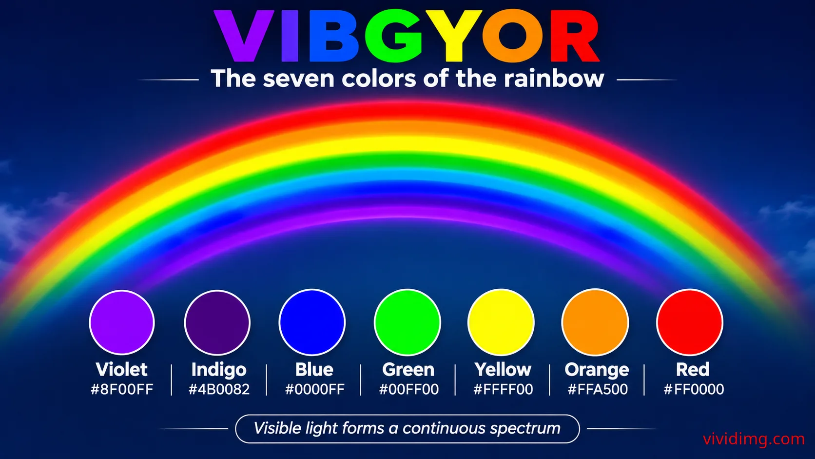
Red is the seventh and final color in the traditional VIBGYOR mnemonic, following violet, indigo, blue, green, yellow, and orange.
The complete sequence is Violet, Indigo, Blue, Green, Yellow, Orange, and Red.
In a primary rainbow, red appears along the outer edge, while violet appears along the inner edge.
Natural rainbow colors transition continuously, so the boundaries between the named color regions are gradual rather than sharply separated.
Red is especially important in color education because it connects spectral wavelengths, RGB primary colors, traditional pigment mixing, complementary hues, color psychology, and practical digital design.
Continue exploring the Color Backgrounds collection
This pure red reference belongs to the VividImg Color Backgrounds educational collection, which explores colors progressively from foundational concepts to advanced color relationships and creative applications.
The collection begins with an introduction to the VIBGYOR rainbow and neutral colors such as white, black, and gray. It then examines individual chromatic colors, their technical specifications, color families, shades, tints, tones, mixing methods, gradients, textures, and advanced color theory.
Pure red introduces essential concepts including RGB primary colors, additive light mixing, spectral wavelengths, relative luminance, complementary hues, accessibility, and warm-color design applications.
Explore the Color Backgrounds collection on VividImg to discover educational color references, practical HEX and RGB codes, visually engaging backgrounds, and detailed explanations for students, teachers, designers, developers, photographers, and creative enthusiasts.
Image statistics
Loading statistics…Top 5 countries
— countries reached · all time
Country data will appear as views are recorded.
Daily views
Last 12 months
- —
- Unique visitors
- —
- Card clicks
- —
- Downloads
- —
- Share actions